- not so Frequently Asked Questions - update 2004/8/31
|
|
Introduction to gnuplot --- Experimental DatPreparation of Data FileHere we describe how to plot experimental data in a data file. There are three data sets in our example, and those data are written sequentially in the file. Each data block is separated by 2 blank lines. The experimental data point (X,Y,Z) is energy points, measured values, and uncertainties in Y. The uncertainties are given as absolute errors, in other words, Z has the same dimension as Y values. A line which begins with "#" is regarded as a comment line, and ignored.
# Data No. 1
 2.1500E-02 1.3060E+00 5.3098E-02
 2.3900E-02 1.2220E+00 4.7043E-02
 2.6800E-02 1.3430E+00 4.9854E-02
 2.9700E-02 1.2580E+00 4.5860E-02
 3.2500E-02 1.2430E+00 4.4506E-02
               ....
 9.4500E-01 1.2290E+00 3.7317E-02
 1.0350E+00 1.2630E+00 4.1449E-02
 1.1330E+00 1.2670E+00 4.2289E-02


# Data No. 2
 2.4000E-02 1.2970E+00 3.1387E-02
 4.0000E-02 1.3060E+00 2.8993E-02
 6.0000E-02 1.2960E+00 2.8382E-02
 8.0000E-02 1.3300E+00 2.8728E-02
              ....
 7.0000E+00 1.2210E+00 2.5031E-02
 7.2000E+00 1.1990E+00 2.5299E-02
 7.4000E+00 1.1860E+00 2.5618E-02


# Data No.3
 2.2500E-02 1.3310E+00 3.4606E-02
 2.7500E-02 1.3370E+00 2.4066E-02
 3.5000E-02 1.3440E+00 2.6880E-02
              ....
 1.8936E+01 1.0080E+00 2.9232E-02
 2.0064E+01 9.6300E-01 2.9853E-02
 2.1296E+01 1.0310E+00 3.1961E-02
Plot DataThose three experimental data sets can be approximated by y = -0.01687 x + 1.3512. This function is plotted with the data which are stored in a file, plotexp.dat. To access each data block in the datafile, use the index keyword to specify the block to be drawn. You can specify the first block by index 0:0 or index 0 . The third block is pointed by index 2. To combine the first and second blocks, use index 0:1 . To plot data with error bars, use with yerrorbars . This requires the error data at the third column in the file, and the columns are specified by using 1:2:3 . If an error is given in percent (%), using 1:2:($2*$3/100.0) converts them into an absolute error. gnuplot> plot "plotexp.dat" index 0:0 using 1:2:3 with yerrorbars,\ > "plotexp.dat" index 1:1 using 1:2:3 with yerrorbars,\ > "plotexp.dat" index 2:2 using 1:2:3 with yerrorbars 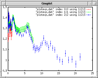 When your command line is too long, put "\" at the end of line, then the next line is treated as a continued line. Gnuplot recognizes short keywords, for example "w" is "with", "i" is "index", and so on. In addition, you can omit a file name if the same file is used, just like the example above. In the next two lines after the first "plot" command line, a short form "" can be used instead of "plotexp.dat". Make a LegendEach experimental data set was measured by three different experimentalists. Their names are, "A. Smith" for the fist one, "B. Smith" for the second, and "C. Smith" for the third, and they carried out the experiments in 1992, 1993, and 1999. gnuplot> plot "plotexp.dat" ind 0:0 usi 1:2:3 ti "A. Smith (1992)" w yerr,\ > "plotexp.dat" ind 1:1 usi 1:2:3 ti "B. Smith (1993)" w yerr,\ > "plotexp.dat" ind 2:2 usi 1:2:3 ti "C. Smith (1999)" w yerr 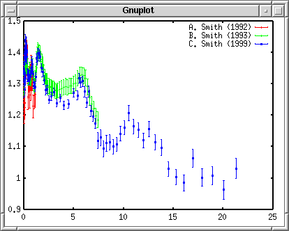 Draw a Calculated LineTo overlay a function and experimental data, the fitted linear function, f(x) = -0.01687*x +1.3512, is defined first. gnuplot> f(x)= -0.01687*x + 1.3512 gnuplot> plot f(x) with lines, \ > "plotexp.dat" ind 0:0 usi 1:2:3 ti "A. Smith (1992)" w yerr,\ > "plotexp.dat" ind 1:1 usi 1:2:3 ti "B. Smith (1993)" w yerr,\ > "plotexp.dat" ind 2:2 usi 1:2:3 ti "C. Smith (1999)" w yerr 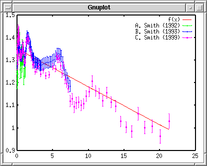 In the above case, color number used for each measurement is shifted because the linear function was inserted at the top. Change the Line StyleThose experimental data are distinguishable by colors when the graph is on your screen. However, to convert it into Postscript you may see a strange symbol as below. In the Postscript terminal the line number 1 is solid, but the number 2,3, and 4 are dashed, dotted lines. So that you get a dashed error bar !  I suppose nobody likes such a funny symbol. Let's define all the lines solid, and each measurement has a distinct symbol. gnuplot> set linestyle 1 lt 1 lw 3 gnuplot> set linestyle 2 lt 1 pt 7 gnuplot> set linestyle 3 lt 1 pt 8 gnuplot> set linestyle 4 lt 1 pt 9 If your gnuplot is newer than ver.3.8: gnuplot> set style line 1 lt 1 lw 3 gnuplot> set style line 2 lt 1 pt 7 gnuplot> set style line 3 lt 1 pt 8 gnuplot> set style line 4 lt 1 pt 9 The first line defines the linestyle No.1 as the solid line with width of 3. The second to fourth lines define the linestyles those are used for experimental data. The line kind is solid, but the symbols of No.7, 8, and 9 are used. gnuplot> f(x)= -0.01687*x + 1.3512 gnuplot> plot f(x) notitle with lines linestyle 1, \ > "plotexp.dat" ind 0:0 usi 1:2:3 ti "A. Smith (1992)" w yerr linestyle 2,\ > "plotexp.dat" ind 1:1 usi 1:2:3 ti "B. Smith (1993)" w yerr linestyle 3,\ > "plotexp.dat" ind 2:2 usi 1:2:3 ti "C. Smith (1999)" w yerr linestyle 4  Insert Axis NamesIn the above graph, a legend for the fitted line was removed with the notitle keyword. Although it is difficult to see this figure since all data points and the line is red, this inconvenience will disappear when it is printed out. Now, make labels for the X and Y axes. The name of X axis is "Energy [MeV]", while the Y axis is "Cross Section [b]". To set those names, use set xlabel and set ylabel . The replot command invokes the "plot" command you typed before, so that you don't need to type the long command again. gnuplot> set xlabel "Energy [MeV]" gnuplot> set ylabel "Cross Section [b]" gnuplot> replot 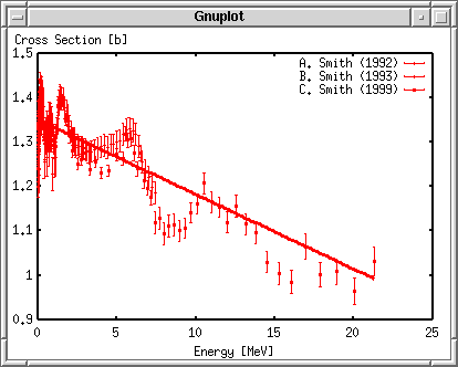 Adjust the RangeThen, adjust the ranges for X and Y axes. For Y axis, setting the minimal value of 0 and the maximal of 2 works fine. There are too many measured data points near X=0. We take logarithm to magnify there. The least X value is set to 0.01, while the largest value is 20. The set logscale {x|y} command controls the logarithm. gnuplot> set xrange [0.01:20] gnuplot> set yrange [0:2] gnuplot> set logscale x gnuplot> replot 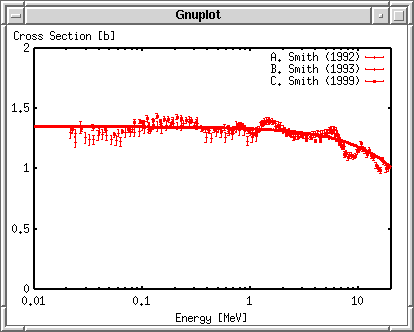 Put GraduationsFinally, put graduations on the axes. The X axis is log, so you can leave it. The Y axis has a tic with an interval of 0.5. Let's set the interval 1, and divide it by 10. In addition, we draw a grid in the graph. The grid is shown at the major tics where you see figures. gnuplot> set ytics 1 gnuplot> set mytics 10 gnuplot> set grid gnuplot> replot  Generate a Postscript FileNow we have completed. With the Postscript driver, specify an output file name, and replot, you get a Postscript graph. Before quit gnuplot, save everything in a file gnuplot> set term postscript gnuplot> set output "plotexp.ps" gnuplot> replot gnuplot> save "plotexp.plt" gnuplot> quit A Postscript printer can generate a printed graph. Postscript browsers like ghostscript or gv, can display the content. The image below was made with gv.  It is not clear to see because the image size is small. Anyway, the No.7 symbol is the filled circle, No.8 is the open triangle, and No.9 is the filled triangle. The kind of symbols and lines depends on the terminal. There are a number of symbols when a Postscript terminal is used, but a limited number of those are practically used for a plot of experimental data, those are circle, triangle, square, and so on (both filled and open). Here is the style numbers of those symbols.
|