|
Here you can see what kinds of graph gnuplot can draw. To specify
the style of graph, with style . To connect the
data points with lines, use with lines . The with
points option places symbols at the data points.
Those styles can be easily combined. For example, to draw
a line graph and a bar graph at the same time:
gnuplot> plot "file.dat" with boxes, "" notitle with lines
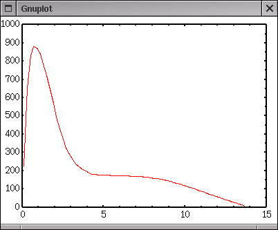
lines
It connects each data point with lines.
Suitable to smoothly varying data. |
 |
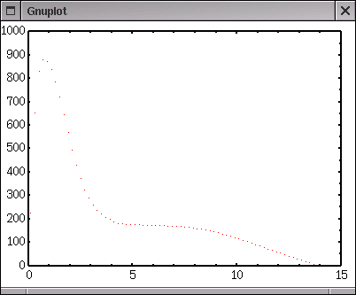
dots
It displays dots, can be used when there many data points,
but hard to see though. |
 |
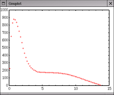
points
Symbols are shown at the data point location, can be used to plot
experimental data. The number of different kinds of symbol
depends on your terminal, but there are at least 6.
The number '-1' is a dot. The size of symbol can be changed
by the set pointsize command. |
 |
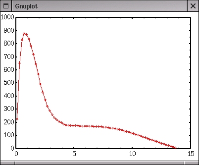
linespoints
lp
Draw lines and symbols at the same time. |
 |
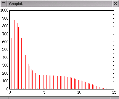
impulses
Draw vertical lines from each data point to X-axis. This is
a bar-graph without width. |
 |
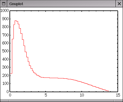
steps
fsteps
histeps
Three kinds of histgram. The difference of those is a definition
of starting and ending points, which you can see below.
Gnuplot can draw a histgram, but it cannot calculate the histgram
data themselves. |
 |
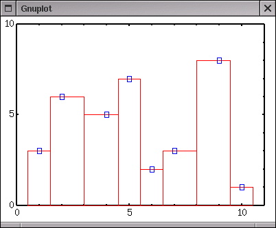
Here you can see the difference of 3 histgrams.
The data position is shown by a blue box. With steps ,
the data point defines an initial position, while the data points
are treated as the final position with fsteps . With
histeps a graph becomes a kind of bar-graph but the bars
stick together.
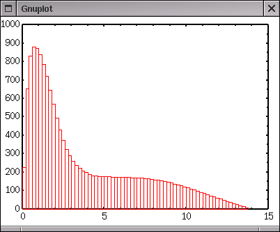
boxes
This bar graph resembles the histgrams above except for vertical
lines. Inside the each bar is empty, cannot be filled with color.
If you want a color-filled bar-graph, exports the produced graph
into some drawing softwares line Tgif, and paint them. |
 |
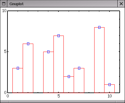
A width of each bar is calculated automatically so that each box
touches the adjucent box. To control the width, use set
boxwidth width. For this case the width of all boxes
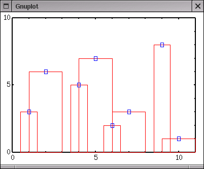
become width . The width can be given by a data file, the
third column (otherwise you can specify the column by using X:Y:Z
where Z becomes the width). In the example below, the data
points are shown by blue symbols
default
Widths are calculated automatically |
 |
set boxwidth 1
Set the width to 1 |
 |
data file
When your data file has the third column, that is
used for the bar-width. In the right figure,
widths of 1,2,1,2... are given in the file |
 |
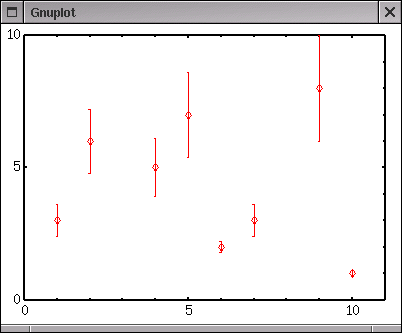
yerrorbars
Same as 'points' but Y values have errors.
The length of error bar is given in a file.
If the data file has 3 columns, the third column
is used as the Y-error, Y plus/minus dY.
It there are 4 columns, the third and fourth columns
are used, likel, Y plus dY1 minus dY2. |
 |
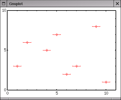
xerrorbars
Same as 'yerrorbars' but the error bars are horizontal. |
 |
xyerrorbars
Both X and Y values have errors. You need 4 or 6 columns data. |
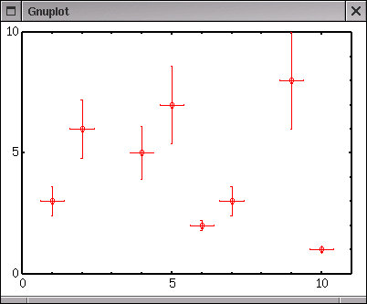 |
See data file how to
specify the data and data errors.
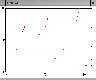
vector
Draw vectors. An arrow is plotted from (X,Y) to (X+dX,Y+dY).
So that you need 4 columns data in your data file. |
 |
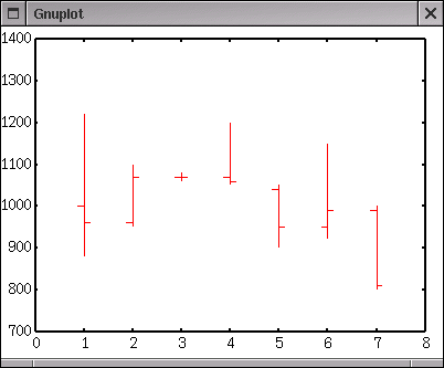
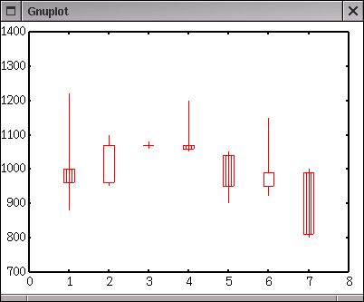
There are two styles those can be used for financial plot. Those
were categorized into "others" here, because the author of this page
is not good at finance :-) Maybe those are used for plotting of
variation of stok or price. The style "financebars" and "candlesticks"
requires 5 columns which are date/time, opening, low, high, and
closing prices, respectively.
financebars
High and low prices are connected with a vertical line,
and opening and closing prices are indicated by small
horizontal tics. The length of the tics can be changed by
set bar. |
 |
candlesticks
Similar to "financebars". A rectangular represents
opening and closing prices, and a horizontal line segment
shows high and low prices. |
 |
|